Hello. Before i'm starting up my asssignment 2, i've done some googling to search for reference as my guide for this assignment. This is one of my reference for the assignment Another reference for this task.
Then im choosing a "Friendship Day" as my theme for this greeting card.
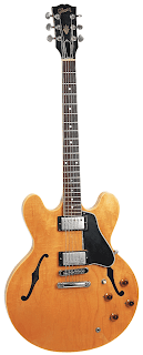
Then by choosing Guitar as the metaphor to represent friend and to make people think a while.
Then i start by experimenting the position of the card.
Then i've create some tag-line or wording for this card.
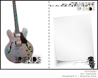
"friends is like a guitar,
bring joy,sad,& every emotion,
buts true friends also brings color in life."
Then by refering to the reference image.iI'm like using colors splash.
1-The guitar is being capture. Crop, Edit (Contrast, Level & Color)
2-The make the Guitar Color effect to greyscale.
3-Then place the guitar on the left side of the card.(the card is divided to half)
4- Using a color splash to make effect to the design.
the color splash is use to represent how friends can color your day.3 piece of color splash image is being using the layer mode is change to multiply.
5- Then the guitar is set the layer mode to - hue. and place the color splash on the guitar to make it look like being splash on the guitar & the splash effect is being repeat to get the best cover up of it..
6- i've cut the head of the guitar and place on the other side of the greeting card to make it like having continuity & balance.
7- a paper note is being place on the other side of the greeting card so that people card write their own writing for the receiver.
8- the note is being crop propertly.
9- the use of white background is to show how simplicity Friendship can be and the use of color splash represent the emotion of how friendship can be
:D This is my final result. This is after few detail is added. Thank You
Tuesday, December 8, 2009
Thursday, November 19, 2009
Sunday, November 15, 2009
Assignment 1 - e-Wallpaper
Open the main photo using Photoshop.
I'm using my friend as my model and capture him in the wanted pose.
Then after opening it using Photoshop,
then i crop it using magnetic lasso tools. for the selected area & adjust the feather, contrast, and other to suite the photo.
copy the crop image, for the next process.
I'm using a crumpled paper as background.
I found it on internet
"http://fc02.deviantart.net/fs29/f/2008/126/8/1/Crumpled_Graph_paper_texture_by_madragonn.jpg"
Then the background is adjusted the color, tone, contrast "auto"
Then I design a doodles using pentools.
use different color to create mood.
I'm choosing doodles style as my theme for my E-Wallaper design
Then paste the crop image of the model before.
adjust its color, tone and contrast.
Add some stroke to the photo.
to have a cartoonist effect like shell-shading.
Add some typo.
"MMU FOM Open day" at the center of it & add effect of film grain.
After done that, create another doodle of bubble talk - and mask it with FOM building that being capture & edited before.
To enhance the photo mood,
Im add effect to it by copy the layer, gaussian blur it with 50 opacity.
And I repeated the process twice.
To mask the FOM building Photo and the Bubble talk, drag the shape of the bubble talk to the FOM image.
Repeat the process for another image.
This is the Image after being repeated.
Add a shape to cover the model nose.
to add funny mood
:D
Then add a font to effect the design.
And add my own personal Detail.
This is the final result after creating this E-Wallpaper.
Thats all thank you.
I'm not a good teacher .
Sorry, but if u willing to learn.
i try to help
:D
Wednesday, November 11, 2009
tutorial 6
here is the final work for my tutorial 6.
im really don't have idea but here is what it goes.
:D
picture refences
"http://uniqueacrylics.co.uk/images/DSC_0844.JPG" - LION
"http://www.gaylordentertainmentcompany.com/images/MediaRoom/HiResPhotos/Ryman/Stage.jpg" - STAGE
"http://pastamanvibration.files.wordpress.com/2009/01/bob_marley_05.jpg" - BOB MARLEY 1
"http://www.thumbplay.com/thumbsup/uploaded_images/damian-736429.jpg" - DAMIAN MARLEY
"http://www.kaynegalleries.com/products/sculptures/all_that_jazz/All%20That%20Jazz%20-%20Reggae%20Vibe%201000X1000%20web.jpg" - Reggae statue
"http://www.orble.com/images/screamin-mad1.jpg" - MIC
"http://humejohnson.files.wordpress.com/2009/09/lymieposterbrown.jpg" - reggae man
"http://www.zastavki.com/pictures/1024x768/2008/Music_Bob_Marley_004804_.jpg" - BOB MARLEY 2
here is somehow i come out with.
hope you like it
:D
Sunday, November 8, 2009
Wednesday, November 4, 2009
make peace - tutorial 4
this is the original image.that being use.
just google it.
im choosing this theme, so its help me plan the work.
planning is the best way to edit
the african boy - https://blogger.googleusercontent.com/img/b/R29vZ2xl/AVvXsEiB-jCwJP3YWImeezUP91AypY7FxwbvUolsGHFKiXyD578lGRdaSXdVF_iv5O5zg27BDlpPVuHM5vBUIMpc8dr1VeqNwOrAiCChim68HXVFTzGlK3JJ4kvIhGR3o8CV4sW2LBIp0j8nJ2Zq/s1600-h/AFRICAN+CRY.jpg
peace finger -http://1.bp.blogspot.com/_eP1orMMkUG8/SVkTX0kCdCI/AAAAAAAAA64/Q7Rn3yCVBAk/s400/ist2_5793934-hand-peace-sign.jpg
peace logo -http://www.thewip.net/contributors/peace-sign.jpg
crumpled paper - http://www.eriding.net/media/photos/environment/recycling/070524_cbrown_mp_env_recyc_035.jpg
im using this paper as the background.
the crumpled paper are being adjust the color,tone, contrast
the boy is place on the paper.
and it been multiply.(in the layer mode)
before that, the boy are being edit.
layer it, filter with gaussian blur filter, opacity it and layer again to bring the dreamy effect of the boy.
then merge it all together
place a Peace words & sum quote
adjust the opacity
after combining all the image. this is the final layout of it
adding peace logo & sign.
to effect it more.
the logo are being wrap to effect the motif & angle
adding my detail.for reference
task 2 final result.
task one
this would be hard.since i dont understand the task very well.but i've done what i think it is.hahaha so its come out with this!
its done that way.
because its old version of computer product.we didn't use floppy disk, CRT monitor, IDE cable..
so it sad. no more being use or its kinda in "the stop of production"
so this is my first task!